Jonan Everett
 Investing can seem super complicated, especially if you’ve seen some of the crazy-looking stock charts out there. Thankfully, stock charts are actually pretty easy to follow if you understand what you’re looking at. Once you know how to read stock charts, you can then start learning about how to use them as part of your investment strategy.
So what are stock charts and how do you read them? Here are a few examples to help you learn.
A Basic Stock Line Chart
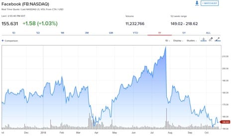
Below is a basic stock line chart from CNBC for Facebook (FB) stock.

First, you’ll see some important data above the chart. Going from left to right, “155.631” was the current price of one share of FB at the time I took a screen shot of the chart, and “+1.58” is the increase in price of the stock since the stock started trading the morning of that day. Meanwhile, “+1.03%” is the price increase in percentage over the same time period.
Volume is how many shares of FB stock have traded throughout the day so far. The 52-week range (“149.02 – 218.62”) is the highest and lowest price for an FB share in the past 52 weeks.
Below this data, you’ll see many time periods you can choose from including 1D (one day), 5D (five days), 1M (one month), and so on. Clicking on each of these will change the date ranges on the chart.
Once you get to the chart, you’ll see that it's fairly easy to read.
The blue line represents the price of one share of FB stock over the time period shown on the X axis. The prices are shown on the Y axis. If you hover your mouse over the chart, a box will pop up that displays further information about that day’s activity for the stock. This includes the opening price, closing price, and highest and lowest prices during the time period quoted. It will also show you the volume for the period.
Another way to visualize the volume traded each day is the tiny bars that extend up from the X axis on the bottom of the chart. The higher the bar, the more shares that were traded during that time period. You can hover over each bar to see the exact volume traded during that period.
A Bar Chart
Below is a bar chart for Amazon (AMZN) from BarChart.

Bar charts look a bit more confusing than line charts, but they’re still fairly simple to read. There are two parts to the above chart. The first is the top portion of the bar chart that shows the price of the stock. The second is the bottom portion, which shows the volume of the stock. Each bar represents one time period, which in this case is 240 minutes.
First, the top chart shows the movement of price over each 240 minute period for each bar. Over the entire chart, the lowest price period will be highlighted with an arc under that bar and the highest price period will be highlighted with an arc over the bar. In this example, the first bar is the lowest price period and has an arc under it.
Each individual line bar shows the range of the stock pricing during that period. The top of the bar is the highest price during the period and the bottom of the bar is the lowest price during that period. The tickmark on the left side of the bar shows the price at the start of the period, while the one on the right side of the bar shows the price at the end of the period.
The second part of the chart is the volume at the bottom. The height of the bar shows how many shares were traded over that time period. If the bar is green, the stock price went up over the period. If the bar is red, the stock price went down during the period.
A Candlestick Chart
Here is a candlestick chart for Alphabet Inc, which is the company that runs Google (GOOG), from Yahoo Finance.

Candlestick charts also look confusing at first, but they're easy to read once you understand them. The top set of lines and bars are the candlesticks and represent the price of a stock. If the filled-in bar of the candlestick is green, the price went up during the period shown. If it's red, the price decreased during the period.
For the green bars, the bottom of the filled-in bar is the opening price for that period and the top of the filled in bar is the closing price for the period. But for the red bars, the top of the filled-in bar is the opening price for that period and the bottom of the filled-in bar is the closing price.
The ends of the skinny lines above and below the filled-in bar represent the highest and lowest price during the period, respectively.
The bars on the bottom represent volume and work exactly the same as the volume bars in bar charts.
Why Do Stock Charts Matter?
If you’re buying and selling individual stocks, these charts can be very important. Charts allow you to see trends, which can help you make decisions about buying or selling an individual stock.
Stock market expert and speaker Tela Holcomb says that stock charts help her make trades. “I use stock charts to identify support and resistance levels (when a stock could potentially stop going up or stop going down) and when a stock is potentially headed up or down in price,” she says. “I do this by using certain indicators that measure whether a stock is trending up or down.”
Holcomb adds that stock charts are also helpful in finding historical trends that are likely to repeat each year. “For instance, AMZN has a history of going up just before Black Friday,” she says. “I discovered this by looking at stock charts for the days and weeks leading up to Black Friday to see that it repeats this trend majority of the time (i.e., eight out of 10 years).”
While this all sounds complicated, it’s just like learning how to read stock charts. Once you understand support and resistance levels and the other indicators Tela talks about, it’s easier to understand how charts can make a big difference in your stock trading.


